Python openpyxl 插入折線圖實例
我就廢話不多說了,還是直接看代碼吧!
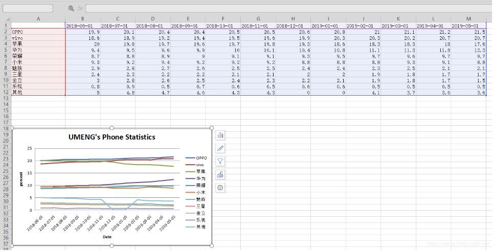
import osimport openpyxlfrom datetime import datefrom openpyxl import Workbookfrom openpyxl.chart import ( Series, LineChart, Reference,)def add_line_chart(title, wss, min_col, min_row, max_col, max_row): c1 = LineChart() c1.title = title # 圖的標(biāo)題 c1.style = 12 # 線條的style c1.y_axis.title = ’percent’ # y坐標(biāo)的標(biāo)題 if ’IDC’ not in title: c1.x_axis.number_format = ’d-mmm’ # 規(guī)定日期格式 這是月,年格式 c1.x_axis.majorTimeUnit = 'Months' # 規(guī)定日期間隔 注意days;Months大寫 c1.x_axis.title = 'Date' # x坐標(biāo)的標(biāo)題 data = Reference(wss, min_col=min_col, min_row=min_row, max_col=max_col, max_row=max_row) # 圖像的數(shù)據(jù) 起始行、起始列、終止行、終止列 c1.add_data(data, titles_from_data=True, from_rows=True) dates = Reference(wss, min_col=2, min_row=1, max_col=max_col) c1.set_categories(dates) wss.add_chart(c1, 'A6') # 將圖表添加到 sheet中def save_data_to_excel(file_name, target_sheet_name): select_cursor = connect.cursor() select_sql = 'select phone_company, record_date, record_percent from phone_statistics where record_company = ’%s’' % target_sheet_name if target_sheet_name == 'IDC': select_sql = 'select phone_company, record_q, record_percent from phone_statistics where record_company = ’%s’' % target_sheet_name select_cursor.execute(select_sql, ()) data_dic = {} all_date = {} all_phone_company = {} for item in select_cursor: if target_sheet_name == 'IDC': data_dic[item[0] + ’_’ + item[1]] = item[2] else: if type(item[1]) == str: data_dic[item[0] + ’_’ + item[1]] = item[2] else: data_dic[item[0] + ’_’ + item[1].strftime('%Y-%m-%d')] = item[2] all_date[item[1]] = 1 all_phone_company[item[0]] = 1 if os.path.exists(file_name): wb = openpyxl.load_workbook(file_name) else: wb = Workbook() try: wb.remove_sheet(wb[’Sheet’]) except Exception as e: pass try: wb.remove_sheet(wb[target_sheet_name]) except Exception as e: pass try: sheet = wb[target_sheet_name] except Exception as e: sheet = wb.create_sheet() start_date_index = ’B’ for each_date in all_date.keys(): if target_sheet_name == 'IDC': sheet[’%s1’ % start_date_index] = each_date else: if type(each_date) == str: sheet[’%s1’ % start_date_index] = each_date else: sheet[’%s1’ % start_date_index] = each_date.strftime('%Y-%m-%d') start_date_index = chr(ord(start_date_index) + 1) start_name_index = 2 for each_name in all_phone_company.keys(): sheet[’A%d’ % start_name_index] = each_name start_name_index += 1 start_date_index = ’B’ start_name_index = 2 for each_date in all_date.keys(): for each_name in all_phone_company.keys(): if target_sheet_name == 'IDC': key = each_name + ’_’ + each_date if key in data_dic: sheet[’%s%d’ % (start_date_index, start_name_index)] = data_dic[key] else: if type(each_date) == str: key = each_name + ’_’ + each_date else: key = each_name + ’_’ + each_date.strftime('%Y-%m-%d') if key in data_dic: sheet[’%s%d’ % (start_date_index, start_name_index)] = data_dic[key] start_name_index += 1 start_date_index = chr(ord(start_date_index) + 1) start_name_index = 2 sheet.title = target_sheet_name sheet.column_dimensions[’A’].width = 20 start_date_index = ’B’ for each_date in all_date.keys(): sheet.column_dimensions[start_date_index].width = 13 start_date_index = chr(ord(start_date_index) + 1) add_line_chart(target_sheet_name.upper() + '’s Phone Statistics', sheet, 1, 2, len(all_date.keys()) + 1, min(15, len(all_phone_company.keys()) + 1)) wb.save(file_name) pass
補充知識:python plotly line chart 折線圖
我就廢話不多說了,還是直接看代碼吧!
# 1 折線圖數(shù)據(jù)# trace1 - 基本格式# trace2 - 更多參數(shù)trace1 = go.Scatter( x = x1, y = y2,)trace2 = go.Scatter( x = x2, y = y2, mode = ’lines’, # 模式:lines 線,markers 點。可用“+”相連 name = ’line2’, # 折線名,顯示于圖例 connectgaps = True # 連接缺失點兩端 默認(rèn)False line = dict( color = (’rgb(205, 12, 24)’), # 顏色 width = 4, #線寬 dash = ’dash’) # 虛線: dash 一一,dot ···,dashdot 一·一) )# 2 打包數(shù)據(jù)data = [trace1,trace2]# 3 格式layout = dict(title = ’折線’, xaxis = dict(title = ’時間’), # 橫軸坐標(biāo) yaxis = dict(title = ’數(shù)量’), # 總軸坐標(biāo) legend=dict(x=1.1,y=1) # 圖例位置 )# 4 打包數(shù)據(jù)+格式fig = dict(data=data, layout=layout)# 5 畫圖py.iplot(fig, filename=’styled-line’)
以上這篇Python openpyxl 插入折線圖實例就是小編分享給大家的全部內(nèi)容了,希望能給大家一個參考,也希望大家多多支持好吧啦網(wǎng)。
相關(guān)文章:
1. Android table布局開發(fā)實現(xiàn)簡單計算器2. IntelliJ IDEA安裝插件的方法步驟3. 理解PHP5中static和const關(guān)鍵字4. php模擬實現(xiàn)斗地主發(fā)牌5. spring acegi security 1.0.0 發(fā)布6. MyBatis中的JdbcType映射使用詳解7. vue 使用localstorage實現(xiàn)面包屑的操作8. Python random庫使用方法及異常處理方案9. .Net Core使用Coravel實現(xiàn)任務(wù)調(diào)度的完整步驟10. Vuex localStorage的具體使用
 網(wǎng)公網(wǎng)安備