JS+CSS實現(xiàn)炫酷光感效果
JS+CSS帶你實現(xiàn)炫酷光感效果,供大家參考,具體內(nèi)容如下
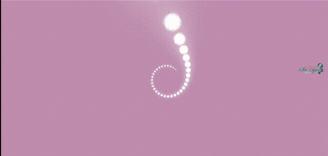
效果一:(螺旋式沉浸視覺感受)
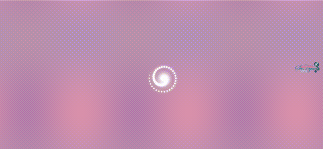
效果二:(旋渦式遠(yuǎn)觀視覺感受)
實現(xiàn)代碼:
<!DOCTYPE html><html> <head> <meta charset='utf-8'> <title>光感效果</title> </head> <style> html,body{ height: 100%; overflow: hidden; } body{ background-color: #c08eaf; } .main{ /* 中心點 */ width: 8px; height: 8px; /* background-color: aqua; */ position: absolute; left: 50%; top: 50%; transform: translate(-50%,-50%); /* *景深,修改此屬性可獲得如上圖展示的不同效果 *如:圖一的perspective為400px *圖二的perspective為800px *修改為其它值還可獲得更多效果 */ perspective: 800px; } .main i{ /* 動點 */ width: 8px; height: 8px; border-radius: 50%; background:white; box-shadow: 0 0 10px 0 white; position: absolute; /* 動畫 */ animation: run 3s ease-in-out infinite; } /* .main i:nth-child(1){ transform: rotate(0deg) translateX(80px); } */ /* 動畫 */ @keyframes run{ 0%{ opacity: 0; } 10%{ opacity: 1; } 100%{ opacity: 1; /* 3D動畫效果 */ transform: translate3d(0,0,560px); } } </style> <body> <div id='main'> </div> </body> <script type='text/javascript'> //獲取元素 var m = document.getElementById('main'); for(var i = 0;i<60;i++){ //創(chuàng)建元素 var newNode = document.createElement('i'); //添加元素 m.appendChild(newNode) //設(shè)置旋轉(zhuǎn)角度 及x軸方向位移距離 newNode.style.transform=`rotate(${i*12}deg) translateX(80px)` //設(shè)置動畫延遲 newNode.style.animationDelay=`${i*0.05}s` } </script></html>
以上就是本文的全部內(nèi)容,希望對大家的學(xué)習(xí)有所幫助,也希望大家多多支持好吧啦網(wǎng)。
相關(guān)文章:
1. IntelliJ IDEA安裝插件的方法步驟2. php模擬實現(xiàn)斗地主發(fā)牌3. 理解PHP5中static和const關(guān)鍵字4. spring acegi security 1.0.0 發(fā)布5. vue 使用localstorage實現(xiàn)面包屑的操作6. MyBatis中的JdbcType映射使用詳解7. Vuex localStorage的具體使用8. Python random庫使用方法及異常處理方案9. .Net Core使用Coravel實現(xiàn)任務(wù)調(diào)度的完整步驟10. Vue封裝一個TodoList的案例與瀏覽器本地緩存的應(yīng)用實現(xiàn)
 網(wǎng)公網(wǎng)安備